Stylizing Cartoon Pencil Sketches & The Color vs. Black-and- White Argument
The cartoon pencil sketch—just the mention makes one picture happy characters, overdone features, and joyful expressions bouncing over clean white paper. But artists fight an age-old question with every stroke and doodle: how much realism should seep in? Given stylization, how bold should one be? And once the sketch is finished would vivid color bring your vision to life, or is the traditional black-and- white approach the most effective? Boiling it all down, we will explore closely what it actually takes to keep your balancing act on point and your creative spirit vibrant.
Cartoon Sketches: Realistic vs. Stylized Tug-of- War
Capturing something realistic and allowing your imagination to go free has an odd tangential dance. For instance, Walt Disney said famously, “there must be a tear for every laugh.” Though he never lost the whimsical exaggeration that made Mickey more than simply a mouse with shoes, he realized that believable emotion results from the artist humanizing their cartoon.
How Realism Pulls the Show Apart
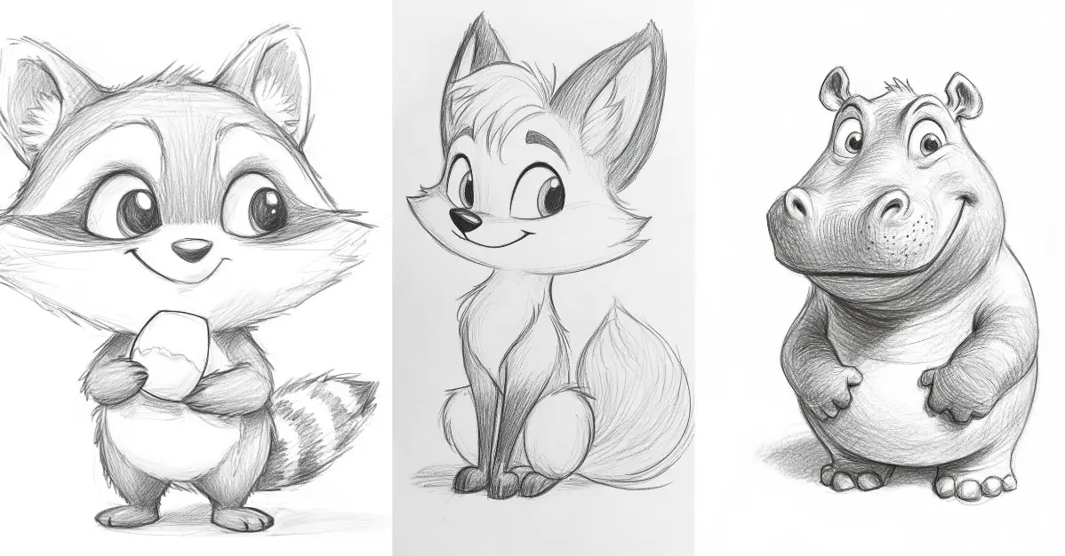
Giving your sketch realism goes beyond simply precise perspective or accurate anatomy. It’s about bringing the crazy down. Should the face of your character show a wild expression, realistic shading or proportion will help to ground their eyes or mouth. We have all seen it—Pixar’s Woody or Buzz Lightyear, for example, has highly stylized heads but their eyes, eyebrows, and general gesture reflect actual human emotion. Then a plastic toy starts to feel like an old acquaintance.
Cartoon with well-placed touches of realism—think of tiny muscular contours, creases in clothing, or convincing body position. This covers background and props as well. Viewers’ acceptance of those bouncy, over-the-top people as part of the universe you have created is simpler in a somewhat more “real” environment.
Still, too much realism runs the danger of rendering your cartoon an illustration. You can lose the enchantment, that feeling of fun, or even confuse your readers. The objective is to create a credible lie—a world that seems genuine but nevertheless invites the impossible—not perfect photographic realism.
Where Stylization Main Attracts
Conversely, stylization deviates from the guidelines. It allows you to simplify and embellish to draw in readers and speed through a narrative. Recall how Charlie Brown’s face spans a few lines, yet his attitude is obvious? Or what about Samurai Jack’s sharp, flexible elements that give every sword swing emotional resonance?
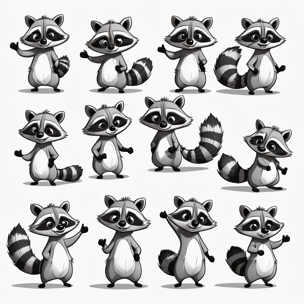
Your hidden weapon for instant visual communication is stylization. Wide motions, crushed skulls, unworkable science. By throwing realism to the wind, one can compress maximum individuality into few phrases. Without words, a properly styled sketch may quickly bring the mood of a character to life. A bear hug is not like a polite handshake.
Style too much, though, and the character can grow to represent more than just an individual. Should every statistic be reduced to soulless blobs, viewers may not develop any emotional connection. It’s about knowing your readership and the desired tone.
Finding Your Own Equilibrium
Many artists struggle with their degree of leaning in either direction. One way to consider this is: Your anchor is realism; your wind is stylized. Keep one foot anchored in reality if you wish your sketch to communicate a distinct story or feeling. For action, silliness, or speed, slants the scales toward stylization.
Consider, “Who am I drawing for?” Comedy and children let wild, zigzaggy lines and larger-than-life faces fit them. If you want more sophisticated themes—even if they are subtle—a little realism adds complexity. Every artist has a sweet spot somewhere on this range; art and science can both help find it.
Color vs. Black-and- White: Pencil and Palace Punch
Once you’ve wrestled with stylization, another fork looms: is this drawing just perfect in majestic monochrome or does it need color? From mood to emotional impact to where the eye settles on the page, this decision transforms everything.
Colour: The Life and Spice
A basic cartoon pencil sketch may become a visual feast thanks in large part to color. A flood of brilliant reds and yellows exudes energy and immediacy. Blues and greens calm; intense contrast can focus attention more quickly than a spotlight. Consider SpongeBob’s wacky color scheme—you wouldn’t want to confuse him with anything else. Some genres and demographics really depend on color; Saturday morning cartoons simply wouldn’t look well in grayscale.
Technically, color enables you to play with psychological effects, break your backdrop from foreground, and let key features leap out. Red, orange, yellow warm colors drive elements forward. Blue, green, purple cool colors fade. Smart use of color harmonies and contrasts gives viewers a shorthand for mood: danger (red), tranquility (blue), sickness (green).
Still, coloring a pencil sketch has some dangers. Too much color might overwhelm, flatten, or perhaps muddy the intention. Sometimes poor digital painting obscures the delicate grey tones of a pencil sketch. The very thing giving the sketch its vitality—the original linework—may be buried.
Black and White: The Authority of Less
Black-and- white comic pencil sketches have a timelessness and purity. Pencil on paper whispers authenticity in stark terms. There is nowhere to hide; if the lines are weak, this is evident. Still, these sketches seem so honest for this reason as well. Look at the Peanuts strips by Charles Schulz or the Calvin and Hobbes by Bill Watterson. Black and white never softened their emotional force.
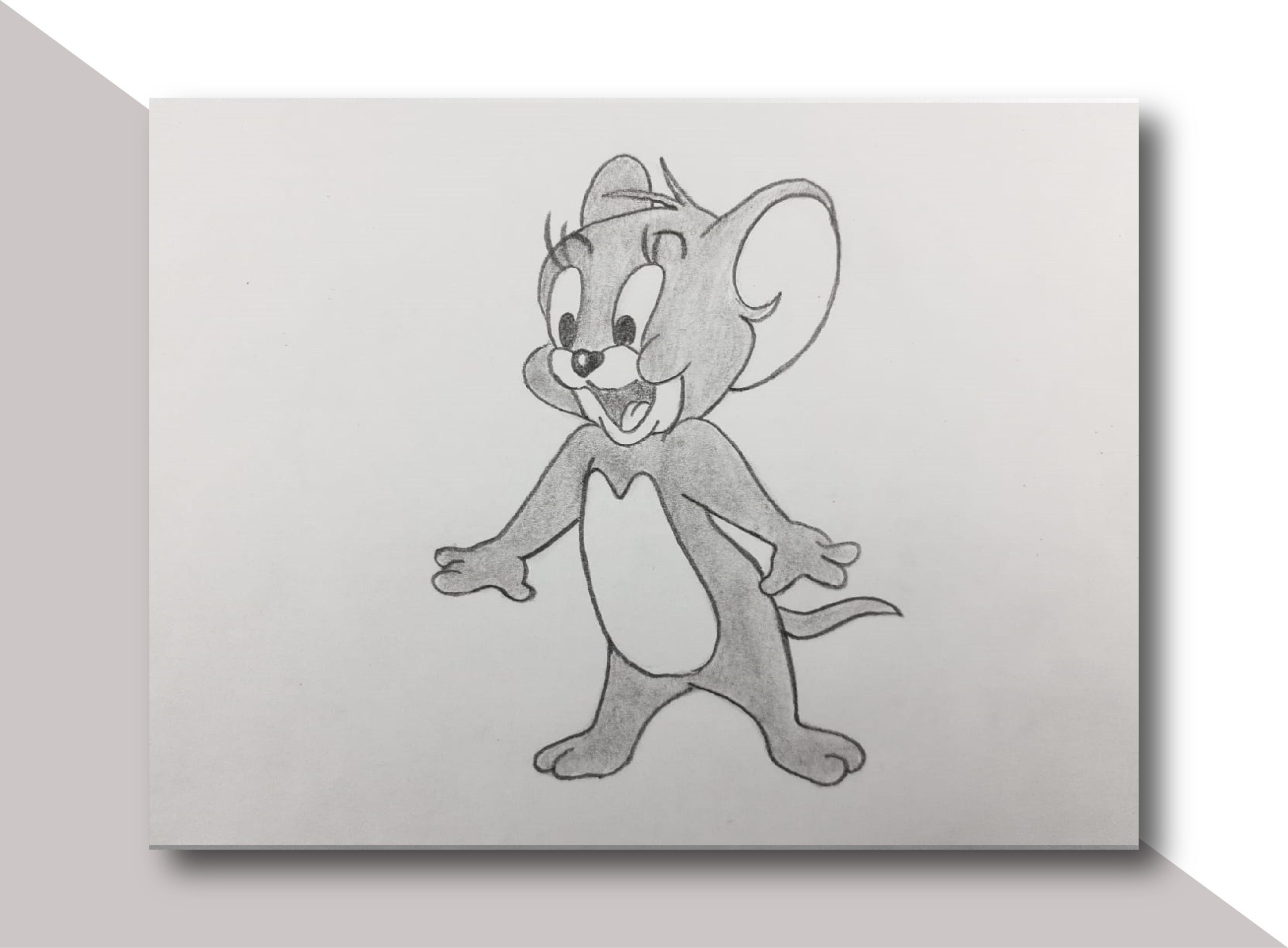
Black-and- white’s strongest suit is its capacity to accentuate linework, texture, and subtlety. Following contours, the eye absorbs every pencil stroke and eraser blur. Shading and cross-hatching produce time and location, depth, and drama. Black-and- white sketches often become timeless, asking the observer to construct their own universe of color and detail onto every picture.
Which One Makes the Most Sense?
Here there is no one-size-fits-all guideline. When you desire brightness, go for impact, or try to attract younger viewers, choose colors. When your linework shines, or when drama and refinement count more than flash, lean on black-and- white.
Experiment: sketch the same cartoon twice, once in rich color and once in plain pencil. Show that to others. This attracts them in? For every variant, what emotions surface? You may find yourself surprised sometimes; perhaps you will notice a strong inclination for one type over the other. That will guide your future work.