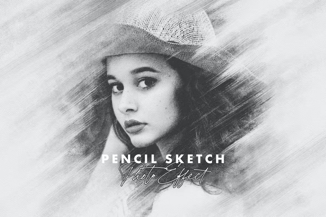
Lighting’s Impact on the Final Pencil Sketch Effect
Many artists and amateurs have been drawn in by the pencil sketch effect. Mastering this style mostly hinges on two factors: lighting and background contrast, whether your preference is for ultra-realistic details or that dreamy, soft-hatched imagination found in journals. Under dusk or a noon sunbeam, a sketch appears quite different; the background color behind your subject could be the secret sauce your work calls for. With a fair dose of pragmatic insight and some genuine experience from my own sketchbook, today I will show how both elements either make or ruin your finished work.
Lighting: the unseen composer of sketches
Lighting is not only something you consider while shading in a shirt’s folds or a face’s contours. It becomes the quiet conductor, orchestrating the symphony of shadow, brightness, and midtone. Let’s talk turkey: although poor glare flattens even the strongest attempt, good illumination can turn a flat doodle into something that pops off the page.
See yourself drawing a wrinkled face. Every wrinkle creates a gentle contour under one, clear source of light—say, a lamp slanted just right. The valleys get more deeply buried. The summits shrink. The output seems vast and cinematic. If you replace that with scattered, chaotic overhead lighting, all those wonderful lines merge into cacophony. Not drama. Not a tale.
Professionals might place a tiny lamp at a 45-degree angle or use a sunny window to strike the ideal shadow and clarity point. Natural light streaming through a small curtain lets details blossom free from strong glare. To replicate that golden hour glow on rainy days, you might grab a warm LED. If you are drawing from a picture, be careful: photos captured with strong flash or numerous coloured lights might confuse the eye when transferred to pencil.
Direct, strong light creates clear, forceful shadows. For architecture or products, this looks great. Morning sunlight or a lamp through paper soft, diffuse light pulls out subtler gradients—needed for portraits and still life. If you find yourself limited with overhead fluorescents, a little creativity will help: move your work station close to a window or create a homemade light tent from a white bedsheet.
Artists even create effects with unusual lights. Throw shadows you wouldn’t believe from candlelight and torchlight. Bite the bullet, turn off the overheads, and play about with a single eccentric bulb. Although the scenario could be unrepeatable, your growing sensitivity to mood and volume will enhance every pencil mark you make.
The Path and Standard of Light
Any filmmaker or photographer is aware that direction counts. Your subject might be squashed by overhead lighting, flattening cheekbones or shortening nose. Under lighting, think of campfire spookiness; side lighting brings details to life.
Sharp and strong, specular light highlights edges and creates great contrast. Imagine a face against a sunny window with strong shadow across the cheeks. Gentle and even is diffuse light. Dreamy, forgiving shadows perfect for accentuating skin or draperies are created by this style produced by shaded lighting or cloud cover.
Combining several light sources produces whimsical effects. Drama and realism can be balanced one strong primary source and a lesser fill. Little changes like a lamp with a coloured bulb can accentuate neutral designs with a subdued mood.
Lighting also influences your cross-hatching or blending perception of colors and tones. Yellow indoor lamps bring warmth; blue daylight gives pages a colder hue. Always scan your work under several lights; snap a quick picture, or hold it up against a window.
Shadows
Often in sketches, turning two-dimensional to three-dimensional depth occurs from the outline alone. Shadows give your forms dimension and sculpting power. Imagine a simple circle; shade one side and suddenly it becomes a sphere receiving light.
Value range, that is the spectrum from darkest to lightest, is everything. Steeper jumps from dark shade to brilliant highlight are produced by hard lighting. This produces sharp, high-octane sketches. Conversely, soft light expands the midtone range and lets you explore with feathery gradients to lure viewers in.
Ignoring the underlying light source will cause you to fight uphill. Try contrasting one shadowed beneath a tree with a pencil sketch of a pepper created in direct sunlight. The first has amazing, carved forms. The second melts silently on the paper. Seeing these elements sharpens your creative sense and accelerates development.
Pencil Detailing, Texture, and the Penultimate
Good lighting does more than just enable you to catch every flaw or follow outlines. It highlights the textures. Raked light highlights the roughness on grainy paper, which comes alive. For the pencil tip itself, a well-lit workplace lets you see how hard or soft you’re pressing, fine-tune your strokes, and avoid unwelcome smudges.
Texture modifies everything. Under slanting light, a rough surface creates little shadows that reward stippling and crosshatches. By comparison, smooth Bristol paper under flat light helps you to get creamy tones.
Do you play about with pencils? In sharp light, hard graphite offers exact, silvery marks. In low-contrast settings, softer graphite creates denser, sootier lines that truly sing.
Using Background Contrast to Emphasize Sketches
Lighting takes the stage, but the background supporting actor here adds emotional force to your artwork. Usually low contrast between subject and background is the reason you find a pencil portrait “disappearing” on the page.
All changes with a basic switch—toning the background. Dark backgrounds help highlights to be visible. Pale backgrounds fit ethereal, high-key images. If you’re stuck, almost unchange the subject by rubbing a light graphite wash behind a face or palm. That pencil drawing effect jumps out with great presence suddenly.
Your pal most likely is contrast. One can build it with tone (bright to dark), with texture (rough vs. smooth), or with line (fine vs. strong). To create high points from the backdrop, play with erasers—kneaded or vinyl—so augmenting the dimensionality of your drawing.
Background contrast still guidelines for digital artists or photographers using pencil sketch filters. Change or crop so the subject shines out. Should you have to, add a digital vignette. Your end image gets more dramatic and readable the more different your focus point is from its backdrop.