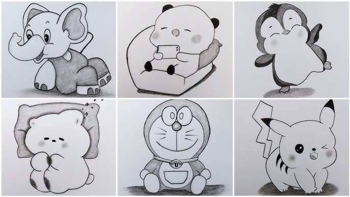
Changing Cartoon Pencil Sketch Face Features
Choosing to try your hand at a cartoon pencil sketch drawing can be like deciding to paint on a blank canvas and flinging erasers—and caution—alongside. Cartoon faces have the odd quality, though, in that bending the norms does not entail breaking them totally. As long as you maintain a stealthy eye on a few foundations, you are free to experiment. Let’s dig right into the middle of it, looking at doable techniques for cartoon face shape and avoiding mistakes that could trip even experienced doodlers.
Eyes: The Lighthouses of Expression
Ever seen how a cartoon face might be created or destroyed with just two eyes? Large peepers often take front stage in sketches; consider classic Disney or manga, where the eyes perform more acting than the mouth. For a goofier look, play with widening the eyes; for a little of mischief, close. Big, round balls scream innocence; slanted ovals could convey snark or distrust.
One newbie mistake, though, is making the eyes so large that eyebrows or forehead have no place. Alternatively, sketch mismatched forms not fitting on the same face. For balanced features, softly pencil the eyes in before pushing hard; nothing shouts “character disaster” like wiping across the page. Recall, little changes take front stage. Sketches against a mirror or flipping your design helps find off-kilter positions before they solidify in stone.
Beyond the conventional circle, try rectangle eyes for austere, square personality types or teardrop-shaped eyes for grief. Keep eyelid lines strong or subdued; don’t hesitate to plop in some quirky lashes for flare.
Noses: Less Can Be More
Cartoon noses challenge reason—or maybe they create their own guidelines. Keep yourself from becoming mired in cartilage and nostrils. There is personality in a little dot, a curved dash, a large honking glob. A large, curving nose might make a figure the wise old wizard; a minimal dot nose screams “youthful sidekick.”
Some painters feel their pictures veer far too realistic even when they slide by drawing every nostril and bridge. Simple tip: first simplify; then simplify some more. If you want comedy, push proportions—pinch or stretch—just be sure the style complements the rest of the face. Remember: viewers forgive an odd nose faster than a dry joke if you ever find yourself wringing over perfection.
Mouths: Creating the Mood
A cartoon mouth often actually speaks words. For comedic delight, try big grins; for roguish appeal, lopsided smiles; for shyness or anxiety, use tight lines. While strong angles indicate roughness or sternness, soft corners help a face to be more welcoming. Play with the placement; move the mouth closer to the chin when things get serious or further up for ridiculous personalities.
A common mistake is leaving the mouth in a neutral line by default—sure, it’s quick, but seldom amusing. Mixed messages also result from forgetting to align the contour of the mouth with the eye expression. Unless you are purposefully injecting a twist of irony, nothing upsets viewers faster than sad eyes with a crazy smile.
Remember to play about as well. Empty space between the lips can communicate as much as a toothful of a grin. To show shouting or speaking, play about with speech bubbles or lines. Make mistakes; they are only stoplights on the road towards your unique style.
Foreheads and Eyebrows, Accent Marks for Cartoons
Like chili salsa in tacos, eyebrows are to cartoons entirely optional but hardly overlooked. To increase drama, push their angles. Wide arches heighten surprise or excitement; a high brow adds doubt. Don’t hesitate to fly off-scale; a large unibrow or micro-brow might drive your character toward comedy or villainy.
Some painters neglect to move the eyebrows with facial expression. Stuck in one spot, eyebrows rob expressive features of life. Let those eyebrows fly upward as a character smiles. If they are enraged, slam them low and tightly. Soft graphite allows you change as you go.
Look at forehead space and head form. Small forehead diminishes the personality by use of squishing techniques. Allow the face to breathe! Try several head forms—egg, square, heart—experimenting until the personality of the character pops.
Ears: The Unsung Masters
Nobody visits a gallery wanting to find the next Van Gogh of cartoon ears. Still, those small lobes and bends ground the face and provide a great anchor for spectacles, jewelry, or crazy caps. To create a friendlier vibe, tuck ears low; for animalistic energy, move them up. Pointy elf ears? Go forward.
As long as they feel playful or deliberate, oversized, little, or missing ears can all be worked with. Unless the punchline is realistic folds, avoid getting mired down in sketching. Think about styling ears with simple lines; they are the subdued sidekicks in the face feature set.
Mixing It Up: Placement and Proportions
Changing Symmetry in Pursuit of Style
Perfect symmetry is not necessary in the lighthearted environment of cartoon art. Actually, it can give objects a somewhat dead quality. Let some features stray off axis. A somewhat twisted smile or mismatched eyes adds instant appeal and character.
Before delving into specifics, light hand block out the fundamental forms. See these as sort of scaffolding. Eyes should be roughly halfway down the head; a mouth should be below the midway line; nose should lie between. Then, creatively deviate from those rules. Are you looking for a caricature? Either inflate the cheeks or exaggerate the nose. Though unified proportions assist, don’t hesitate to welcome asymmetry for visual impact.
Many beginners find themselves caught in a trap where they either crush the top or bottom of the face by positioning features either too high or low on the skull. Step back often and squint at your sketch. This little method helps one clearly see when something is wrong. Try lightly drawing in guide lines to keep things under control if features seem floating or disconnected.
Shading and Depth: Driving Up Volume
Even with a basic #2 pencil, adding a bit of shading will help a cartoon come alive. Think on light sources: from above, below, or the side? Drop shadows under nose or chins using gentle, layered pencil strokes to suggest that the face is three-dimensional rather than merely a flat pancake.
Don’t overreach. Features will melt together like mumbled ice cream when you swamp your drawing with shadow. Maintain its lightness and breezy quality. The smaller strokes for shade, bold lines for contours. For seamless transitions, blend with a finger or blending stump; never lose the clarity defining cartoon style.